Inking Devastation: Godzilla Minus One
Recently, I went to see Takashi Yamazaki’s Godzilla Minus One. Then I went and saw it again. A day later, I saw it a third time. It wasn’t too long ago Godzilla movies were just a fun diversion that I could take or leave. But this week I have spent hours meticulously doodling Godzilla like some ten year old kid back from the Sunday afternoon Creature Features, and I’ve been planning a fourth trip to see it before it leaves theatres. I have been stomped into submission by Godzilla Minus One.

So let’s go over my process for this. One of the time-and-resource-saving methods I use is drawing the rough sketches digitally in Clip Studio Paint. It’s easier to erase mistakes, I don’t burn though pencils or paper, and I can avail myself of the various ruler and transform tools the app offers to get the preliminary sketch just the way I want it. Once I do, I print it out on 11x17 paper and use a lightpad to transfer it to, in this case, Arches hot press watercolor paper. (I’ll link to all of my tools and materials below)

I’ll be honest, one of the reasons I went with heavy, cotton watercolor paper is because I thought I might use ink wash for tone and I needed a paper that wouldn’t buckle.

But once I started laying down the heavy, brushed inks of Godzilla’s scaly skin, I started vacillating about the wash and, considering the bombastic subject matter, I imagined a more precise, pen and ink treatment might be interesting. My indecision cost me a couple of days where the piece just sat there on the drawing table, staring back at me every time I walked by. Sometimes it’s good to take a step back and collect your thoughts.

I figured I’d finish inking Godzilla while I worked through my indecision. Pen or Brush. I was already using both, so either would suffice, depending on how I handled it.
Ink wash is fantastic for things like smoke, smog, clouds. And with a flick of the wrist, you can spatter inks to look like the debris Godzilla’s kicking up as he’s smashing a city. So I was leaning toward wash for a while. But I also started this piece thinking it would be wild to draw all this destruction with a controlled ink line and hatching. I just couldn’t envision it completely in my head. So I did a test.

I printed out my scanned sketch of the piece and tried a few different hatching techniques for the sky, rubble, and dust clouds. The test hinted at a really controlled, measured feel in a drawing whose subject was anything but controlled or measured. The contrast won me over, so I went with it.
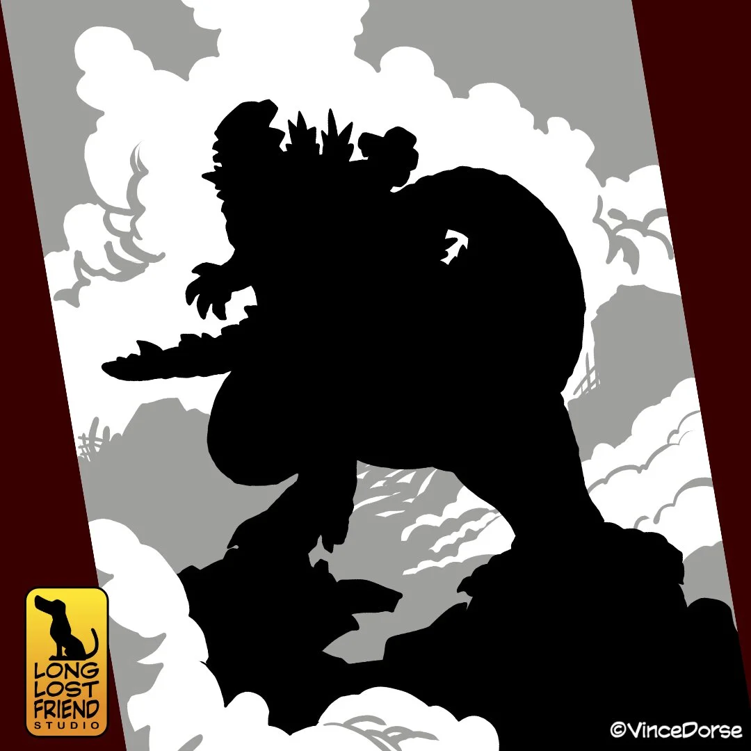
This is very simplified, but my idea was to establish three basic values — lights, mids, and darks — and bounce them off each other in the composition to lead the eye. Godzilla and his shadow would account for most of the high contrast darks, and he’d be surrounded by the billowing white clouds, which would be framed by the mid-tones.

Another reason I took a run at a Godzilla illustration — aside from being inspired by what was probably the most entertaining and terrifying monster movie I’ve seen in a long time — is because I don’t normally draw this stuff: crumbling buildings, streets turned to rubble, colossal monsters. And I like to try things I’m not entirely comfortable with. It may not always turn out fantastic, but it’s a good way to test yourself.

I had a little moment of doubt when I started to render the dust clouds. I know that a watery grey and black wash would have looked more realistic. But after a few strokes of the pen, I finally started seeing what I was aiming for: an ink drawing that’s content to be a drawing. It’s not trying to convince anyone it’s a photograph or a painting. It’s an ink drawing and the more lines I laid down, the more I liked it.

I’m pretty happy with the final illustration. I do see some opportunities for improvement, and hopefully I can incorporate those lessons into the next piece I do. I’m satisfied with those soft, sweeping clouds near the top of the piece that could potentially look right at home in any classic nature illustration. And I like that those gentle clouds frame a nuclear-fueled titan turning a city into rubble. It’s actually a pretty good visual representation of how Godzilla Minus One felt — a back and forth between the quiet and the loud, the placid and the terrifying. The movie is rich in inspiration, and I’ll probably revisit it one way or another.
Tools and Materials
Here’s a short list of materials I used to work on Godzilla.
If you want to see me work on this piece, we used it as a backdrop for our review of Godzilla Minus One in this week’s video.